Showing posts with label colour. Show all posts

Friday, June 30, 2017

Embracing white and red

I have just had an amazing week.  No! No news on the housing front.  I am reconciling to another winter here.  But...

Before I reconciled that,  I consoled myself with playing around with OOTD's which are outfits of the day.  In my case that is pretty casual..  I wore a comfy outfit all day and when I went to post it to the 40+ style club  private FB page I realized I hadn't felt uplifted.  Hmm, why not?  My conclusion was that it was primarily a warm palette and I am a cool winter.   What we wear does affect how we feel.  You know the motto- Dress for Success!  Then I got to making my ootd's in neutrals.  Stone/beige is tricky.  All white is a stretch for this messy gal.   But greys ...

This could be my look!  Now to add some colour, but not piles as too much colour seems to overwhelm me.

Here are the details I posted:

#ellenpukalo #hourglass
Ready or not! Momentous week. OOTD had me working with neutrals. Colour I have a handle on. Contrast I get, sort of. Value even in quilting is my struggle. So low value contrast causes me angst! Ditched all black. Not too smart because I just eliminated a lovely distinguishing line. edgy, Tracy? Light neutrals and a hint of soft femininity, Sally. ( 'member I wanna be sweet). Guess that means I load up on white cause beige is tricky for me since I am reconciled to not being a warm winter. lol So what cubby hole did I stash all the tints in? grey- silver and all the lovely other light to medium greys. duh!
My style as it continues to evolve: A- amiable, red is one of the colours that draws people in.(learned that in public speaking) Full out red and white is more contrast than I want/need. Therefore, A- is for accessories! A little dab will do you! And they don't have to scream like a scarlet letter. oye! red running shoes, Autumn ;) B- backgrounds, my light and going to be versatile and interesting neutrals! yay! C- creativity shown with accessories on my background canvas (note the c) and my soon to be revived sewing skills! (help Deborah)
Hope I am not unrealistically optimistic (tis my nature/style) but I have managed this month to somewhat gather and corral all the galloping and wildly plunging ponies in my personal style stable and head through the colour gate for July! whoo hoo Ruth Essex   Gosh, Canada has a birthday and EVERYTHING is red and white especially this weekend! ha, I'll be right in style.
I have included my neutrals in the comments. Note this isn't so much about styling- just figuring my backdrop. Get out your red pencils all you 40+ers!


And then these were the various options:
 
This is what I would hope is more stone than that common pink beige. Even with some accessorizing with colour it is pretty blah.

actually I'm a bit stumped to accessorize.


ivory? not so hot, how about we call it a tint of hopefully clear cool yellow. I was hoping anyway!

a little edge? A lot of creativity. I did make the tote.

So the 'best' ??? for last. white, black, grey This is where I learned black with white spots is very different from white with black spots!

Hitting my stride!


I had this fabric in my considerable stash and thought hmmm.  Not flowers.  I am not a floral person and turns out flowers/prints relate best on gals with lots of highlights (texture to their hair).  I am light and sleek.  I hadn't known that but I have never been much for prints, especially small prints.  This fabric shows lots of colour tint options and some edgy X's to bump things up from blah.

Then I went to have my shower and now the whole FB site knows I posted in my jammies!  lol 
Because....tadah!

I just LUV, LUV, LUV! my IKEA shower curtain.  Lots of white, some smooshy, watercoloury, tints that are a light/medium value, and that lovely black line!  BINGO!

                             Color
 The topic for 40plusstyle club in July is colour and I must admit that Ruth Essex has so changed my perceptions with her insight into the looks we put up on the site.  She tells us why or why not it works.  So helpful and now she is doing the master class for this month.  Here is a video I snagged to show you why I think July is gonna be a red letter month!  If this link doesn't work it can be viewed on the public FB page- https://www.facebook.com/40PlusStyle
 

S0...  OOTD and accessorizing. I need a red statement necklace.   Actually, I am pretty pumped.  Home decor, personal clothing style and a focus for my fibre arts and even my jewelry making justification (all those beads but no big red ones) is all starting to make sense.  I'm a little bit, well, maybe a lot, ADD when it comes to colours and style so all this understanding could be a good anchor.    Looks like I really have something to celebrate!

Tuesday, April 4, 2017

Spring Song


About two days ago it started getting noisy around here.  I don't need another hobby so I was resisting looking.  But last night I knew the little guy was in the tree behind my bedroom window!  Big puffy chest.  ???

This morning I went out to hang up the bedding on the line.  Ah, a robin!  Of course, they like to nest in that old potting shed and sit in the trees!  I can put away the bird book. phew!

And whereas I need rubber boots to stand at the clothes line, (lowest place on the yard, I think);  it is probably time to start thinking about spring chores

                                         
But I have been on a bit of a tangent.  AGAIN!   I have been 'analyzing' my clothes.  TOO much information!  I thought I had it just about licked when it was dropped into my screen that the colour of our hair, eyes and skin 'greatly' influences our clothing choices.  I knew through colour season analysis that I was a winter (circa 1975)  and I knew aging dulls things a bit.  But I was kinda thrown of my main tangent trail into a side eddy when I realized just how much my colouring has changed (2017).  I am mostly neutral- dark brown hair is totally silver now, brown eyes are a dull hazel and my skin has never been shiny and colourful.  So I am neutral dominant and light valued.  I do best in a monochromatic colour scheme in a mid range and with a light bright thrown in or perhaps an analogous palette which I really do luv!  Can you here me yip yipping?  I SEE says the blind man. Makes sense to me!   And if you think monochromatic is boring-  check out the vivienne files

My styling for our house sale has gone to a neutral background with a monochromatic colour for major pieces and pops of soft accent colours!  I luv it! I feel validated!
 
 It also explains my monochromatic flower beds!

This should directly impact my creative art journey.  Knowing what I know I'll be able to eliminate a lot of impulse spending and add some great art!
Whoo hoo!   I'll be springing into action and singing a new song!


Thursday, January 19, 2017

FYI Purple/Violet


Purple or violet is a secondary colour that is mixed with two primary colours.  It is difficult to get consistent results so I just buy a big basic purple. This tube is Basics Dioxazine Purple.  It saves time and frustration.  Likely one can buy red violet and blue violet as well but then the art budget and the storage limitations are strained.    Mixing more or less red or blue gives the derivatives. Sort of...

It depends on whether one uses a warm or cool red and a warm or cool blue.  And then there are all the variations and combinations.  We won't do the math on the percentage of blue verses red!  eek!  I like and use purple but I'm kinda glad that purple/violet isn't my most favourite and used colour.  ;^)

And to add to the diversity there are various colour wheels.  Joen Wolfrom includes violet and purple in her colour wheel and 3-in-1 colour tool.  I can see that this makes sense.  But still...


One can see that 'it is complicated'!  lol   So sticking to the KIS students principle, I will stick with the simpler 12 colour colour wheel and buy a big tube of purple to which I'll add warm or cool reds depending on the temperature of my story!

Wednesday, January 18, 2017

A Royal Story


Once a week I head off to see my grand kiddies,  a royal prince and his princess sisters.  We do Art 101 and then Literature Appreciation.

Having observed my rather normal (typical) grandchildren I would say it is never too young to introduce art.
Jolina, the youngest (4), was just kinda encouraged to do her own thing off to one side.  She has amazed me with her interest, ability, and fine motor skills.   Eliana, just turned seven, is messy, independent, and fearless. I might add tearless but it would be untrue as she gets quite dismayed when abilities don't match her aspirations!  Can anyone else relate?  Joshua is almost nine.  He is tidy, focused and likes the details.


I want to foster a luv for journaling.  We begin with a binder that is their planner/journal. At this point it is very visual. I also realized I need to use my motto-  KIS Students!  They don't have a limitless attention span so I must keep an eye on the clock.   Since we are always coming back to the colour wheel which has 12 segments I decided we would begin in January and do a colour a month.  A little forethought and we should hit the warm colours in time for summer.  ;^)  Sometimes I amaze myself!  LOL

Looking through the designated drawer for their supplies I realized I needed to fine tune things.  By season???   Again, not a full room sort but just a better dividing of categories.  As I search,  I reassign the stickers and scraps.  I can also see what I have in abundance (summer) and what I lack (blue violet).  :/

She has leaves figured.  House orientation not so much.

Final revision.  Lesson learned- markers are permanent!

hmm, what's between sky and ground?
The format for the actual class is an old art book.The publishing date page is missing but Art Stories * Book Three* looks to me like it predates Dick and Jane!    "Through varied pictures and interesting reading the child is made increasingly conscious of beauty of colour, form, and line as seen in nature, pictures, in all his surroundings.  Elementary ideas of drawing, painting, sculpture, design, architecture, interior decoration, costume, and civic art are thus introduced in a setting of natural child interests and activities."  Not only does it simplify my planning but it is fun!

Winter is devoted to that royal colour purple, or more correctly violet.  January is red violet.  February, the secondary colour violet, and March will be blue violet.

We finish our time together with a chapter or two.   Sometimes the children draw and colour as I read and sometimes we just snuggle and imagine the lives of royal children.  A grand story indeed!

Wednesday, May 23, 2012

wow, what if...

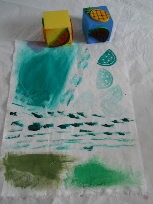
Yesterday I was trying all my primary and secondary colours on plain sketchpad paper.  I wanted a reference for exact hues when I wanted to use say, red, which can be a blue red (cool) or an orange red (warm). When I got all my colours on the papers I had a what if moment!  What if I put the colours on cloth?   Then I remembered that I had bought dyes and paints for fabrics. 

Dying fabric is not the same as painting fabric.  The colours adhere differently.  I wanted to see what painting would show as I have dye samples already.  I have a couple of dye posts under my To Dye For page.


So I unearthed my Pebo Setacolours and a few odd jars of fabric paint.  I did try a few acrylic paints meant for paper.  I wish I had also got white in Setacolour as it would be very useful to have the lighter, clearer options.


Here is what I discovered.


My favorite colour.  I did try to get orange by mixing the 2 different reds with yellow. 


Red has more variations that I'd have thought possible!


Purple is tricky.  The light area on the fabric is watered down lots. I tried mixing blue and red watercolours to get a violet. I need to spend some time mixing colours because when I did get the setacolours it was with the idea of mixing other options. But it was recommended that purple be specifically bought.  I can see why.


I'm not a baby blue person but I'm gaining an appreciation for cobalt blue.  Aqua is another favorite colour.
I did a small area of dirty water.  lol  Even the dirty water is useful for backgrounds.  But straight craft acrylics are very stiff.  The fabric paints are much softer.


The inks tend to bleed a lot and they are very matt.  Hmm, I wonder if you added some glitzy stuff???


My biggest surprise was how well fabric paint stamped. These are very cheap kid's foam stamps.   I see no value in painting backgrounds when dyeing is softer and easier.  But dyes would probably bleed in making marks so paint is the way to go!  Even the craft acrylics would be useful for stamping, especially if one used a light hand on applying the acrylic and in pressing the stamp.

This seems like a lot of work but really it is helping me become more familiar with the various mediums and how they look and react.  I'd like to think these are warm up exercises before I take the plunge.  Perhaps it could also be stalling but I'm beginning to get the urge to actually try all these options out.  And that will be a good thing!

I'm linking up to TN&TN so if you'd like to see what my neighbours are doing, please click on the link.

Monday, May 21, 2012

White flowers!


Chokecherry shrubs are almost like weeds where I live.  But I've grown to luv them.  These have always been on the west wall of the house.  When we moved here I tried to get rid of them, not realizing that they respond with even more suckering.  I finally gave up and over time I've appreciated the morning sounds of birds in the branches, some even sitting on the window sill.  They smell lovely also.


A brief walk about the yard shows the candy tuft survived my transplanting.


My Solomon's Seal is spreading away. 


The hostas are doing their thing.  I can't believe I originally rejected them as part of my plant arsenal.  Good grief, they are hardy, low care and slowly expand.  I even like the flowers which were disparaged once upon  time.  But I'm more for foliage than flowers.


These are some kind of little bulb that multiplies like crazy but most of the year just looks like grass.


The Labrador violets are a cool ground cover and the white lamium is probably here to stay as it resists weeding out.    This is pretty much from my white section although the weeds are making everything into a white colour scheme. 


The variety of weeds in the flower beds astounds me.  When I feel like I've got one kind licked, a new one takes over in the next year.  This year I have an incredible array of what my farmer says is stink weed!  From my Girl Guide days I can also identify Shepherd's Purse! :(


                            There is also some yellow which is turning into some real dandy white fluff.  :(


This is Prairie Smoke, a wild flower.  Also low care and the seed heads will be fluffy white.  It also goes by the name, Old Man's Whiskers.  See the bee, lower left.  He is busy.  My farmer, who has retired from farming, is joining the flower bed brigade and we'll be busy as bees ourselves restoring order to the flower beds.  He likes big, fat, blowzy flowers!  I'd threatened the weeds with the lawn mower but the Rooster says we have to preserve our mental health so we'll be keeping the flowers.  Shoot, I was all set for mixed shrub beds!  
 
He isn't quite up to snuff so after his nap we'll do the walk about and I'll be taking note of the new head gardener's plans!  The upside means the flowers will come from his budget now and I can buy coloured art supplies from my allowance!  yippee skippee


And while he naps I'm getting ready to spread some colour on my white pages because the next section for the Altered Book tutorial is colour!  Luv it!!! 

Wednesday, March 28, 2012

Wow, what's my style


I have not had a lot of time in the playroom this week.  I have had a few isolated moments to skim through my new book, The Artist Unique- inspiration and ttechniques to discover your creative signature.
A few have expressed curiosity in it.

Most of us began the creative journey by following patterns and kits or making class samples.  The author Carmen Torbus points out that was is missing is 'me'.    


This book helps identify the 'me' that is buried under all the stuff that is submerged under all our prepackaged project replicas, our excuses and our fears. 

The first section in the book is The Artist's Toolbox.  It follows that an electrician's tool box is different from a plumber's. There would also be differences in an electrician who specializes in wiring houses and one who  wires cars or even computers. 

I have been introduced to the words, mark making, during these last few weeks.  I find the term very liberating. Anyone can make marks!  Albeit some make better marks than others,  it is a good place to start.  The author starts with mark making tools and the ones we like to use help identify our signature.  The aha was that there are further variations.  Acrylic paint can be thick and precise.  But it can also be watery and sloppy.  More variations would be how the medium is applied and to what art surface. 

There is a worksheet that asks, what's on your palette? 


A visit to your local garden centre will help identify what flower shapes and colours appeal. 

I was very blessed to take a workshop with Jane Sassaman and I luv her style.  We stylized our favorite flower and made a wall hanging.  Mine was a day lily. 


 The two teal spikes were Jane's contribution.  I need to get over my own fear of wrecking this and finish it. 


A visit to the paint section can reveal what you reach out for.  Unfortunately I have collected every colour and combo available.  I never met a colour I didn't like.  So my challenge was to go a bit deeper and settle on a particular colour scheme. 


I have discovered I prefer low contrast so analogous colours, even monochromatic,  would be my preferred style.


An at home scavenger hunt reveals a lot about colours that repeat in ones life.  I try to stay out of the kitchen so I looked in my closet.  I've simplified my wardrobe to aqua's and chartreuse with a dark neutral.


Then the seeker is encouraged to visualize their favorite spot.


I think it would be the actual beach rather than the water.  Strolling down a beach seems to make me sigh.
What colours make me happiest, comfortable, safe, daring, alive?  What colours scream ME?

Mellow yellow, aqua, and white with bits of purple.   I have saved this calender for years and many of the pages are stuck up on various bulletin boards.  I think it is my style! (giggle)
The bulk of the book is devoted to Discovering Technique.  Fifteen contributing artists, each with their unique style, shares a favourite technique, insights and advice about coming into your own as an artist. 
I'll be trying them sometime soon.  I do have a vague idea of how I want to portray my work but it is good to keep ones options open!

If I were creating art for myself, and surely that is the best reason to do it, I suspect mellow yellow would translate to aged book pages.  Aqua would be a colour wash background sepia photos with  hand written notes in India ink, pearlized buttons stitched unto hand dyed fabric showcasing thread patterns.  This would  just might make me sigh, happily.

So I've begun to identify that I like to work on combinations of fabric, paper, and even canvas.  I like paint or dyes translucent, spread  thinly, loosely, with a big brush.  I'd have outlines and details with a thin black marker.  I would make use of stamps, stencils and some creative paraphernalia.  I prefer analogous colour schemes, in a simple representational style. I'm 2/3 of the way there.

The last section is Defining Your Style.  There is another worksheet with a checklist for skill inventory.  Lots of things we do are not necessarily art related but art isn't created in a sterile vacuum.  Skills we use daily can reveal our unique creative style.

This section also addresses the fears, the routines, the stalls, etc. that stop our creativity.  I am held speechless by the first paragraph as it so identifies me.  I leap in where angels fear to tread and then at the peak of creativity I stall- a victim of my inner critic.


The good news is that I have my hand on that guy's heel and I want to get a better look at him. I'm going to demand to see his credentials with the intent to kick him to the curb!  Besides, I'd like to make Jane proud and finish my day lily piece.  ;^)