Showing posts with label AB 101. Show all posts

Thursday, May 22, 2014

Mother, may I marry?


(noun) - Texture, an element of art, is used to describe either the way a three-dimensional work actually feels when touched, or the visual "feel" of a two-dimensional work.

 In the visual arts, texture is the perceived surface quality of a work of art. It is an element of two-dimensional and three-dimensional design and is distinguished by its perceived visual and physical properties. Use of texture, along with other elements of design, can convey a variety of messages and emotions.

 Texture refers to surface and is in fact surface. Everything that has surface has texture.  It can be 3-D, tactile, touchable.  It can be 2-D, visual, an illusion.  Texture makes things interesting.  Texture can be felt or it can be seen as light skims the surface revealing the texture.

I hope to use both kinds of texture as I work on my mothers and daughters memory pages and honour them as the princesses that they are.

Lutradur has texture.  It can be seen and felt.

Lutradur can be run through an embossing folder and die cut machine.  More texture.

An ink spray will not add texture because it soaks into the fibres that already show texture.

But paints lay on the surface and if applied thickly will add texture.  This example has a thin layer of paint that adds a matte texture because it obscures the fibres.

In keeping with flat techniques, foils add 2-D shine.  I tried double sided tape.  The first bit was an example of how not to apply foil.  The score tape holds VERY fast so there was no second try.  :O  I imagine that one could make their own washi tape or even Lutradur 'ribbons'!.

But then there are all the wonderful products that are actually formulated to add texture.  Tactile texture.  I have a small sampling of Golden products to try.

The dimensional paints are lightweight and grab the Lutradur easily when they are dotted on.

My wee bottle of  Puff Paint was old so I ended up spreading a glop of it through a fine stencil.  Then I used a heat gun on the front and on the back.  This produced a very cool (hot) happening because the close heat dissolved some of the light weight Lutraur  and added a lacy effect that isn't really showing in the photo. Another surprise was the how little actual weight there was to the finished product.

I coloured  fibre paste and used it through a stencil on some Lutradur that already had an image stenciled printed on it.  
The fibre paste enhanced the rough brick look. My sample jar of coarse pumice gel would have done something similar I imagine. The molding paste and the extra heavy gel would have been smoother.  Good for snow drifts or wedding cake icing.  :^) 

My first try with the clear tar gel revealed that it is a thick but runny substance.  I tried confining it to a stencil but it 'relaxes'.  It would make a good drawing substance, again like icing squeezed from a cake decorating tip.  I did sprinkle some glitter on before it dried.

Embossing products do the same thing but with a flatter effect.  Again I sprinkled glitter on.

This example uses both kinds of texture.  I used the leaf mask and over sprayed.   When it was dry I smeared the glass beads through the stencil.  Masks and stencils with the same motif more than double creative options!    These are from Joggles which is a GREAT source of techniques and products.

The texture gel, Glass Beads adds some weight to the finished fibre art.  I choose not to colour my beads.  I felt like I had it way too thick so I carefully laid the stencil back down and scraped some off.  It is pretty stiff stuff.  Micro beads and gel would likely produce a similar result.

I was most impressed by Lutradur's ability to support heavy materials.  I squeezed a lot of Glossy accents down on the Lutradur and piled lots of beads on top.  No problem!

And we can add texture with fabric, threads, beads, etc.  I had a large selection to choose from as I worked on my brides page.


I am feeling like I have leaped from kindergarten crayons to marrying straight out of school.  I kinda did but the learning curve usually has more steps in it.  Again I have a lot to put on one page.  Four generations.   I stenciled onto a sheer fabric for my background and then ironed it onto a thick base that had an adhesive on each side.  Four photos fit if I cropped and did ovals.  That took a week alone to figure out. :^)  I was all for lace and beads but this seemed to require a more subtle effect.  The size decreases and the frames are cardboard.  I tried to make them fit each bride's sensibilities.  The photos will be cut and added later because I am printing my own.  In the process I smeared one in my hurrying.  :( I may fiddle a bit more as I couldn't find a bit of velvet ribbon to represent my own dress.   I daren't linger overlong because there are ten more pages to prepare and if I tarry too long somebody else may find a nice groom!  lol

This page required some mindfulness as the palette is creamy white.  The interest must come from the texture but it also required an understated elegance.  The bride may look like a princess in frothy laces but I do believe most mothers manage to get some good solid stiffening into the bride's backbone and corset which supports the softer layers and shows off all that lovely texture.

Lutradur is kinda like that as well. 

So when we lift the bubbly to toast the beautiful bride lets give a wink to the mothers, the teachers, the supporting cast that helped bring another princess into the kingdom to show off the textures that enhance our lives.

Friday, November 9, 2012

Still Fiddling


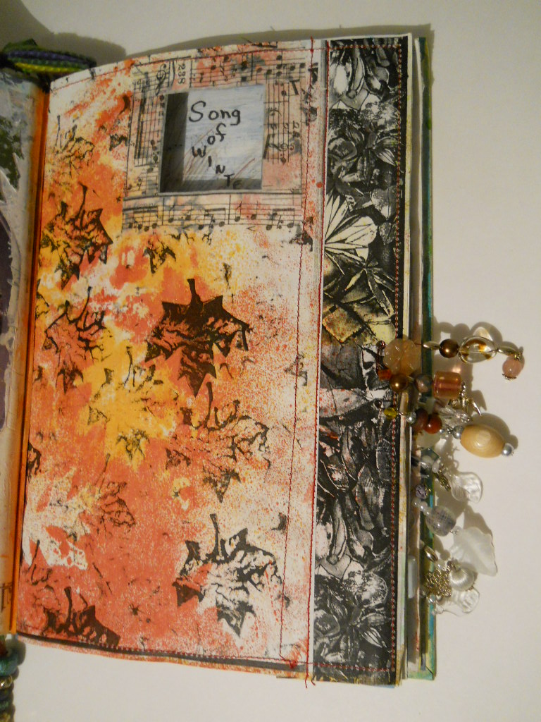
This beading of edges is rather addicting.  I decided to add some to represent fall and winter.


I didn't have any coloured glass leaves but I didn't let that stop me.  I am even more convinced about the need to have stuff on hand!  lol


I finished off the bottom with some winter effects, even some clear leaves.  I also added some snow sequins to the page.  White and tone on tone white.  I luv it!


I had a small piece of lace doily that fit nicely on the warm inside page but relates to the barren and leafless but snowy outdoor page.

I have a back page to tweak and a painted page for the inside back cover.  Then by golly, she'll be done.

Speaking of snow, the weather people are all gloom and doom about an approaching storm.  I'm say, "let it snow, let it snow, let it snow!".  Just wish I had more supplies so I could fiddle! LOL

Tuesday, October 9, 2012

Packing Tape Images


Okay, it is a go for Tuesday Tutorials and I'm working on the next Altered Book technique.

I've not done any transfers before and these seem relatively easy although I am wondering why one wouldn't just cut out the image and adhere it with a gel medium to the page.  White backgrounds would give a transparent look and that would certainly be worthwhile.  Bulk might also be an issue.  The shine could be dulled with some matt gel medium.


The images are limited to the clear packing tape width but apparently old clear contact sheets work. They are placed right sides down and then burnished.  I must admit that keeping strips of the tape free and not attached to itself, obects and even other images is a bit challenging.  


I burnished away in all directions.


These are all the images burnished and facing upwards.  I burnished them on the front just for good measure as well as the back.


I dropped them into warm water.  They curled right away. and I began to rub the paper off the tape which was pretty easy.


Here they all are drying on a paper towel. I shall be finding places for them in my Leaves Altered book and my calendar journal.  But not today.

That is all I got done today as I have small and busy house guests!  I also have my DD suggesting searches for glass door knobs. I think we need to get the Rooster searching Kijiji now that he has finally found his truck and doesn't know what to do with his computer time!!!  LOL  I wonder if he needs a tutorial? ;^)

Monday, September 3, 2012

Edging into September with Beaded AB and Calendar pages


I should have posted a few hours ago but I got all caught up in making pages for the September Calendar Journal.


I finished up the last week of August with a pocket for the old calendar page.  I like doing a tag a day and kinda personalizing them.   The tag with a couple of beads and a leaf was the day I tackled my beaded edging.  :)


I tweaked the first day of September with ribbon to cover the sewing and added a bigger sticker to cover a bad choice for a sticker.  Then I added 3 black crystals to the September page set. We are bringing on the Bling!  The September page says, "she understood the need for change"!  This is an understatement as I seem to be facing it on all fronts!  


I had done the first set of pages for September and was doing the rest of the month.  The first was too bright even after an initial attempt to get the two pages to flow together so...


I dulled it down and added a bit of bling to Jolina's photo.  I had already adhered the flower and the sticker  so I tried to be careful.  The first photo of the post shows the better flow.

~~~~~~~~~

I really liked adding the beads to the Altered Book on Leaves that I'm working on alongside some others over at Bluebeard and Elizabeth's blog,  Altered Book Lover.  Lesson 16 was the beading tutorial with links to the lesson on windows and doors.  Lesson 17 is our next tutorial for polymer clay but the links for the beaded edges are at the end.  I hope you'll check out my classmates endeavours.


At first I thought thread might work but was cautioned that I need some stiffening to support the heavy beads so I was off to buy wire.  I ended up looking through a couple of beading books on the book shelf at Michael's to see what the thinnest wire was and these nice coloured ones are 26 gauge.  The higher the number the thinner the wire.  The pliers can rub some of the finish off but I was happy with how it worked.  But first I reinforced the edge and used black gesso to colour the piece of card stock that I had glued to the back of the page.  I punched holes and just threaded beads on after tucking the loose end around the wire and up into the first bead.  It took a bit to relax and get creative but it was so much fun I was soon trying various arrangements.


I had precut the wire and barely made it to the end.  I remembered crimp beads and was able to add one so I could pinch it for a good finish!


I did add a bit more red to the bottom of the page and I think I can call this set finished.  They are 'tip ins' and are ready to be glued into the book.


The back looks okay so I don't feel the need to disguise it at all.

I am definitely going to be adding this great technique to my books and journals!

Monday, July 16, 2012

Altered Book


I somehow have gotten out of sync with my AB posts.  


 It might be the distractions!


Somehow I was thinking Elizabeth at The Altered Book Lover had us on pockets.  I had a wax paper envelope that I put leaves into.  I sprayed some of the coloured cardboard leaves various colours and put them into the envelope. 


I particularly like the idea of sewing the pockets on.  I also want to put more pockets in my calendar journal to hold ephemera and tags that will have info and events. This is a stamped coffee filter, used but dry! 


So my Leaf book has a pocket on the inside cover.  I tried to make it with some room and not just flat to the page.  I am realizing I am needing to start to pull this book together;  hence the circles.

 Then I made a tip in for the summer section and made a pocket from a paper doily that  had been used as a stencil.  The background is scrapbook paper with a decoupaged image and I added a bit of cotton lace, a flower sticker and some stamping to the doily pocket. I'll put tags in which will probably hold flowers with leaves in their stems.

I then got busy on a folded page.  This needed 3 pages which I don't have in the leaf book so I made this in another altered book which is 'Just Me'.


The right and left pages were painted and then stamped with circles to coordinate with the centre which has scrap booking paper on it and is folded and glued down.  I punched 2 small holes for buttons which hold a clear circle from a cd package.  I used a paint pen to add something to the clear circle.


This 2 page spread will detail my non existent exercise program!  ha!


I have post it notes throughout the leaf book.  We do have an over view of the lessons so that must explain why I had been making a window.  ???

That is for an upcoming class so now I am really confused! lol

But I am learning lots and certainly enjoying this Altered Book tutorial.

Monday, June 11, 2012

Backgrounds

To start, I gesso most everything.


I've been told that gesso is a good primer and stops buckling.  I'm doing most of these backgrounds for my calendar journal which comprises manila folders so that's what I'll be illustrating.


I use acrylic craft paint and this is the second layer.  Too thick I think!


I tried to drop alcohol on and I'm wasn't impressed.  I tried the alcohol ink and it was a bit better.  I spritzed with water and that was more exciting.  I think I need to study inks or something!


Now I'm already learning that spreading acrylic with a plastic card works pretty good but if I want texture a dry brush on a few drops works slick!


Then I shook some watered down acrylic unto the pages.


I did this several times and the last time I also added some dots to the lower left page with the end of the brush.  I'm kinda into dots!  These were a little thicker and as each new layer should dry I decided to go ahead and try some bubble wrap on the right page.


That turned out pretty cool!


Then I brushed acrylic onto a stamp I'd made with a foam circle glued to cardboard.
 

I want to point out that the left hand background was started on another day.  My calendar pages are two page spreads and they should somewhat relate.  So I am using common colours and shapes to tie them together.  I'm not really wanting matchy matchy, though.


Ink:  I was up for trying ink again!

I removed the wrapping from my pen and nib and dipped into orange ink and wrote a day of the week.  So far so good. I decided to outline some circles.  This could have been edgy but...  I was raised in the school era where you had to master the straight pen before you could load up with the fountain pen and it was a few years before they allowed ballpoint.  It is like riding a bicycle.  You never forget!  lol  I may have to find a caligraphy book.


A few stamps. 


The yellow is going to be too subtle but Burnt Copper stands out.


Back to acrylic.  Who knew that toilet paper rolls were so cool!


Or the side of a plastic card!


My next try was to stamp first.  I also collaged some bits of torn paper which I adhered with gel medium.


Then I added first one colour of acrylic and then the other.  These are dry brushed.


Then I stenciled on some glimmer mist onto the left page.That is the positive image.  I flipped the stencil onto the right page and pressed the stencil down so the negative image would be on the right.  No waste!  This page is not finished but I am learning that they don't all need to be done in a slam bam manner!  lol  Let's just say I'm thinking!  ;^)

Now that turned out so well that my first journal page is not looking so cute anymore. I should have done more thinking!!!   I first viewed the adding of many layers to cover up previous layers as a bit wasteful!  But not everything goes as planned and that is why there are paper towels or baby wipes available to remove, soften or blend.  This time I won't even batt an eye!