Creativity 101 featured the booklet we'd made last week. My gal painted most of the backgrounds green, her favourite colour. The theme has now been decided and it'll be Christmas. First technique was to spread some white stuff on all that green grass. ;) Lines were laid down for snow banks. But green still figures prominently in our first pages where the hunt for the perfect tree will be portrayed. Trees are just lines that have been enclosed, completing a shape. Lines also give direction and we talked about moving our eyes around but not out of the page. Using the shape of a triangle we exaggerated it to make three spruce trees in different sizes. We are also learning to practice a bit before we commit to the actual page. ;) Next week we commit.
I have challenged myself to use a blue monochromatic colour scheme for this week's scrapbook page. "The range of different blues is enormous, and using too large a selection can end in disaster. There is a vast difference in tone and atmosphere between a greenish blue, like turquoise, and one that veers towards mauve. The wisest and safest course is to experiment with different degrees of one shade, using it deeper or lighter as needed or adding one of the gray-tinged neutrals as a highlighter." I don't often use blue. If I do, it is usually robin's egg blue which is heavily influenced by green. "Turquoise is the trickiest of all the blue-greens. It is really in a color class of its own and rarely blends well with other blues unless the very lightest or darkest shades are chosen." My favourite colour! :O
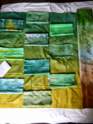
I continue to move fabric around the wall hanging as I chase those tricky bits of sunshine and shadow. Blur is good for the squint test but I think I am needing a new camera as it is slow in some light conditions and the on button is very tricky and needs a deep press on one side. :O Hey, time to treat myself!
Today's trick will be to get my errands successfully completed and back before the colourful grand kiddies arrive for supper. Another treat!


