Showing posts with label layers. Show all posts

Thursday, May 8, 2014

Mother, may I colour...


There seems to be some artistic genes in my mother's gene pool.  She, herself, didn't draw or paint although I have this red parrot.  The parrot is actually painted on the glass, perhaps with the outline traced. The gold background is a paper. 

I do have a very vivid memory of my mum using pencil crayons on colour by number pages. The pictures looked just like the paint by number kits and were pretty involved.  I also remember her putting crayon pictures between wax paper and ironing them onto fabric. 

Crayons aren't just for the kindergarten crowd.  There are some serious artists using crayons as their preferred medium, adding them as highlights or even using the simple wax crayon as a final layer to watercolours, gouache or acrylics.  This makes sense when you realize what wax crayons are.

"Oil pastels and wax crayons are serious media in the arts and not only a toy for children. Oil pastels and wax crayons are names for basically the same type of medium. However wax crayon is usually the label for a cheaper qualities and children toys. This misconception probably is the reason why these media are not as popular as soft pastels or traditional oil color in the art world. There is a difference in the quality of the pigments and the binders that are used in the production of artists grades and more simple grades. Oil pastels and wax crayons are a very versatile and exciting media that allow creating unique artwork. Many illustrators use them in their mixed media work for special effects. Only if you want to create artwork for permanent display I would commend not to use less light fast,cheaper,wax crayons."  quoted from here

The options for colouring on Lutrador are pretty extensive.

Lutradur is transparent, even the heavier weight. Using a permanent marker I can choose which side and I don't need to worry about mirror imaging if there is no writing.
I used an old newspaper article featuring a Ruby Kim block of the week that my grandmother and my mother had saved.  Not wanting to mark on the old newsprint I  photocopied it, outlined the lines with a black marker and then placed it under Lutradur and copied the lines.

I used the original crayon colours that were in my crayon box way back when.  The sky is one layer of blue and I heat set it face down on printer paper with my iron.

The green is two layers, each heat set.  The bark is three layers as are the apples.  An interesting bonus is positioning the lutradur on the printer paper so that the image continues to be ironed in the same place.

I had done some water soluble crayons but a 12 x12 background only has so much room. :O

Then I was ready to try melting wax crayons.

I was surprised that different brands of crayons melt differently and the large child's crayon was really hard to melt and dripped the slowest.  Controlling the drips takes some practice.  In hindsight I can see that a non porous surface would produce better shaped dots if high round dots were desired.

Then I put the heat gun to the Lutradur with the wax drips.  The Lutradur melted without reheating the drips unduly.  That was a cool hot technique!

I prepared a background on white scrapbook paper, using gesso, paper images, gel medium and acrylics.

I began to arrange my story.   I am relatively new to mixed media and I must admit I was a trifle boggled by how this would all work out. The mind is an amazing creative tool.  As I began with the first thing- a commitment to explore crayons and lutradur and a few memories;  thoughts began to suggest themselves and I pursued hotly!  lol  The idea to frame my crayon drawing brought to mind the crayon box colours.  My image is a bit big so do I need all of it on the page?  How then should I treat the edge?  How can I colour things to represent past, present and future?  Gosh,  I hate covering goodness up!  lol  Layers!  I need to see covering up as necessary for layers.  Some tulle should dull the colours a bit and some stitching should add some pizazz.  And then there are those great splatters that pull everything together.

I need to spend more time developing layers and achieving depth.  In the end I didn't use the tulle.   The lovely concise wax dots got melted when I ironed from the back in preparation for putting the back scrapbook paper on for strength and to hide any stitches, brads, etc. :(  So I covered it with another try on mulberry paper.  Not as good but...  This was a good page to start with because I expect my pages to improve as I go along just as colouring inside the lines improves with the doing!

Some things that didn't make the time crunch:

-melting wax crayons between wax paper to make skins which are cut into shapes
-melting wax crayons and using a tjanting tool
-buffing wax crayon work, especially metallic crayons
-dripping melting crayons from the top of the page
-notching crayons and scraping them across paper
-using a texture plate
-using crayons as a resist with paint, even faux batik
-crayons used to antique brown paper bags
-etching


I'm so glad I asked if I could could color!!!

Tuesday, September 10, 2013

Patience is a what?

I am learning as I go.   I do need to make haste slowly.  This did obviously not dry between layers.  :(

I am learning to tape things down so they stay flat and I really like the white border.  I'm not so sure the blurriness is the camera or lighting but rather a wanna be artist who wants to see it fast and has no patience. 

This is just more leftover paint from the stencil.  I did it on Dollar Store card stock.  The paint had dried from the first layer.  Nothing wasted as I continue to learn.  But...
There is no virtue in hurrying!

Monday, June 11, 2012

Backgrounds

To start, I gesso most everything.


I've been told that gesso is a good primer and stops buckling.  I'm doing most of these backgrounds for my calendar journal which comprises manila folders so that's what I'll be illustrating.


I use acrylic craft paint and this is the second layer.  Too thick I think!


I tried to drop alcohol on and I'm wasn't impressed.  I tried the alcohol ink and it was a bit better.  I spritzed with water and that was more exciting.  I think I need to study inks or something!


Now I'm already learning that spreading acrylic with a plastic card works pretty good but if I want texture a dry brush on a few drops works slick!


Then I shook some watered down acrylic unto the pages.


I did this several times and the last time I also added some dots to the lower left page with the end of the brush.  I'm kinda into dots!  These were a little thicker and as each new layer should dry I decided to go ahead and try some bubble wrap on the right page.


That turned out pretty cool!


Then I brushed acrylic onto a stamp I'd made with a foam circle glued to cardboard.
 

I want to point out that the left hand background was started on another day.  My calendar pages are two page spreads and they should somewhat relate.  So I am using common colours and shapes to tie them together.  I'm not really wanting matchy matchy, though.


Ink:  I was up for trying ink again!

I removed the wrapping from my pen and nib and dipped into orange ink and wrote a day of the week.  So far so good. I decided to outline some circles.  This could have been edgy but...  I was raised in the school era where you had to master the straight pen before you could load up with the fountain pen and it was a few years before they allowed ballpoint.  It is like riding a bicycle.  You never forget!  lol  I may have to find a caligraphy book.


A few stamps. 


The yellow is going to be too subtle but Burnt Copper stands out.


Back to acrylic.  Who knew that toilet paper rolls were so cool!


Or the side of a plastic card!


My next try was to stamp first.  I also collaged some bits of torn paper which I adhered with gel medium.


Then I added first one colour of acrylic and then the other.  These are dry brushed.


Then I stenciled on some glimmer mist onto the left page.That is the positive image.  I flipped the stencil onto the right page and pressed the stencil down so the negative image would be on the right.  No waste!  This page is not finished but I am learning that they don't all need to be done in a slam bam manner!  lol  Let's just say I'm thinking!  ;^)

Now that turned out so well that my first journal page is not looking so cute anymore. I should have done more thinking!!!   I first viewed the adding of many layers to cover up previous layers as a bit wasteful!  But not everything goes as planned and that is why there are paper towels or baby wipes available to remove, soften or blend.  This time I won't even batt an eye! 

Monday, May 2, 2011

look what I found!


I was away for the weekend and hopefully rested and refreshed because I have a lot to finish up for the quilt show. I was tempted to just put down quilt show five times on my list but the devil is in the details they say so I will detail the new week in the side bar and in my day book.


I was also very excited to FIND out something about my style. My word for the year is find and I do need to identify what my particular style is. I'm all over the place but not really settled on one thing. I know I can't 'do it all' so I'd like to fine tune my options. I was MQing the straight lines on the convergence and admiring the way it has layers, depth! As I read about mixed media techniques I am very drawn to the layering and how that creates such richness to pieces. I thought about my favorite quilt! My style is going to involve layers of depth, of interest! I'm quite delighted to be discovering these things.
This Trellis quilt is a pattern that I tweaked many, many years ago. The lattice has 2 white tone on tone fabrics that hardly show any dimension. That was a bit disappointing but value is something I knew I needed to work on. I do like white lattices and I surely didn't want a bold lattice.
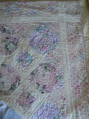
I did not have enough of the Hoffman floral fabric so I added a very close fabric that I'm almost sure has some polyester in it. But it really works well and the bit of brightness adds some depth to the florals peeking thru the trellis.


I really like the border fabric, the subtle pattern and washes of colour. I also felt very much in the 'zone' with the free motion quilting. I hate marking and I found the path for easy outlining of the trellis. Then I did leaves and flowers in the open areas. I just think 'leaf' and draw it and I must admit I can do a better drawing with the sewing machine needle than I can with a pencil. Same with the flowers which are pretty much fantasy. I like a subtle variegated thread. I used the even feed foot for a spine in the border and then just filled in with flower shapes.


But it is really the layers that I like so much in this quilt. I want to leave bought patterns behind but this one so appealed and I was pleased with how it all turned out and now I find that I understand why. Layers are the way for me to go! 8^)