Showing posts with label design principles. Show all posts

Monday, April 30, 2012

Time stops for no one!


The part 2 for the Altered Book tutorial is due today and I am less than ready.  Elizabeth, who is An Altered Book Lover, has been sharing a lot of info on the design principles.  I will definitely be revisiting these as there is much to learn and it is incredibly fascinating.

This spread is not finished.  My theme is leaves so this is a large landscape.  A hand with a magnifying glass is highlighting a leaf.  I am wanting to convey motion, but subtle motion.  Hopefully the eye is focused on the magnifying glass which should be showing dominance but is also subtle.  Then by just looking down, one sees a man who is using a team of oxen to skid tree trunks. They just enter the next page which is an opening into a courtyard. This should move the eye through the arch to circle back into the landscape which is trees that grow on open soil.  And that is where the magnifying glass is positioned. A circle conveys the idea of motion.  Repetition is achieved by colours and outdoor elements.


Leaves are affected by the seasons and I want a tip in page for summer.
This old musician appealed and his shoe pom poms are repeated in the roses and then again in the magazine page that features flowered wallpaper and a large dimensional pom pom flower as wall art.  One great thing about posting these pages is viewing them from a different perspective.  The wall paper flowered section is actually positioned behind the musician's section but that isn't what I'm a seeing here.  So...


 I tweaked things a bit with a colour which was to age things and it is appropriate because the musician is an old painting.  But the wall paper didn't recede enough.
   

I drew in some leaves and repositioned the clock.

There is also a bit of contrast with the modern wall paper in the upper left and the renaissance feel to the lower right.  I suppose the restrictions of time are contrary to the dreaminess.
And now it is time to look to the next lesson.

Monday, April 23, 2012

Its a Monday


The weekend is over and most of the toys are put away.  Mind you, they do seem to like my playroom and my toys more than theirs.   lol

I did get a bit of time to glue and stamp in my journal.  This present AB class is continuing the design elements.


I tried to illustrate Rhythm which is repeating patterns.  So one side is obvious pattern of the square shape with a few colours.  The right side pattern is time which definitely has a rhythm to it.


This is movement which isn't just swirls. Motion is shown in a couple dancing,  music,  a stairway, or a scene that carries the eye about the page or canvas.  I want to explore this more this week.


But then I headed back to Rhythm and pattern. Really fascinating!

And speaking of...        I better get ready for beading!

Monday, April 16, 2012

altering books Lesson Five


Elizabeth has packed lots of design principles into this lesson.  I'm going to be hard pressed to come up with classy pages! 

She is right.  There is much to learn about the various aspects of design and various schools of thought.

This lesson focuses on HUB and Ps.

Harmony, Unity, Balance with  Proportion and emphasiS

With harmony everything should get along:


With unity all should at least be marching in step.


Balance keeps the main character form tipping over and off the page.


Proportion seems harder to define but emphasis means focal point to my way of thinking.


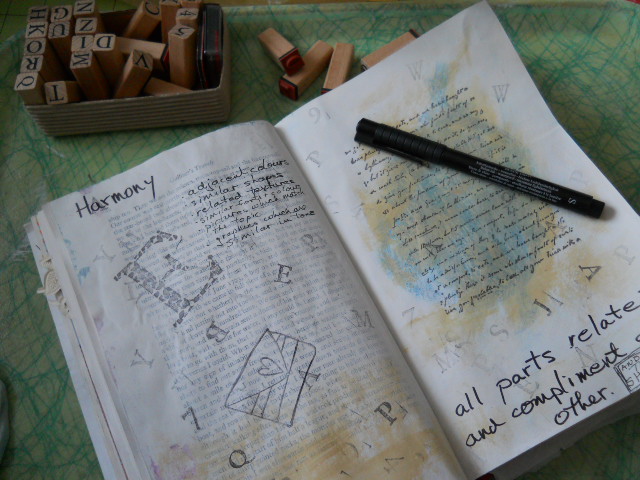
This is my Harmony exercise.


I was really on a roll with Unity and it was my AHA moment. 


 Balance was pretty much a copy from a google search.  I prefer asymmetrical balance so that takes a bit more understanding.


Proportion  is also defined with the Fibonacci Ratio which intrigues me.  I was fortunate to be on an appropriate part of Gulliver's Travels in my technique book which is where I am doing my exercises before trying them in my theme book.


Emphasis is fairly easy to my way of thinking.


Hopefully this has H U B and Ps  (harmony, unity, balance and some proportion and emphasis)

My theme book is trees/leaves and is a Snoopy and the gang  thin encyclopedia:


Harmony


Unity


Balance on the left and then Proportion top and emphasis bottom.

I don't quite consider these finished as obviously we have only begun the lessons so I'm anticipating coming back and revisiting these as my capabilities increase.  I also counted future  lessons and available pages and I'll be returning to some of these and combining a few lessons.  This has been such a great learning class.  Much thanks to Elizabeth.  I'll be linking up to some other student's work.

Thursday, April 5, 2012

The more I learn...


                                                             KEEP IT SIMPLE SWEETIE!


Elizabeth has started the next session with design principles.  Everyone lists the elements differently.


I like the HUB acronym and then the ps.  This page not so much, but then I probably am not done with it either.


The theme book I started has limited pages so I'm reviewing and documenting in another book.


This is NOT a work of art.  Neither is it my style.


This is a workbook.


Harmony:
It really is a good exercise to learn about the design elements as if this was the first time you heard of them.  The resources are often given different approaches and one commentator's description may clarify or enhance anther's.


Unity:
I definitely got a better handle on both harmony and unity although there are similarities to each.  Two down and three to go.

What a fun play day.  I do believe what 'I got' has stuck and I am much more comfortable with the whole creative process.