Thursday, May 31, 2012

Creativity 101 off and running


Designing with dots is such an exciting concept.  My mind is just full of all the ideas I see and all the what if's...


I am very random.  Jenn is obviously more linear.


We did some doodling with dots on paper with markers after we'd moved the glass dots around.  I do think they really are dots because they are not balls.  They have flat bottoms.


And then we played with the Gelli plate.


We are getting into open circles here, but this was my most favorite.  I am so appreciating working with Jenn because she does things different from the way I'd do them and I hope we are learning from each other. 
                    
                                                          It was an amazing day!

Tuesday, May 29, 2012

WOW- Gelli anyone?


Well, when the Gelli plate comes out of its package and lays on the worktable it looks about as exciting as sliced bread.  But I have to tell you that when the peanut butter and jelly is spread things begin to get very tasty and exciting!  And I don't even like peanut butter and jelly! 

 
I have the larger size and it is a bit pricey for a peanut butter budget.  BUT- it is worth every penny and you can always make your own jelly to stretch the food budget! lol


                                    I added cheap craft acrylic paint right on the Gelli plate's surface.
                                                I have it placed on an old glass cutting board.

I spread it with my brayer.  Two brayers are ideal as one is wet and one is or should be dry.


I began to create.  It isn't necessary to clean every time.  A little forethought helps though.


I had to stop and flap my chin back up in place sometimes!

And I began to move. Might be due to hyperactivity, just saying.   I had prepared various kinds of papers and some cotton fabric but I was soon avalanching paper and book piles in a grab for more.  Paint bottles were knocked over.  I stubbed my toe on a drawer that had not been closed after a search for texture.  No time for compassion.  Whoo hoo!


I tried a new rubbing plate.  Needs some technique tweaking but do-able.


      Plastic netting.  This was very cool and the net could be placed on something else for another effect.  The netting is still laying on the Gelli plate in this photo.  Later there is a photo showing the netting placed on another piece.  This worked so clear and sharp that I was flabbergasted!


 A Feather!  This is just how the fabric pulls back from the Gelli plate and leaves the feather with the paint under it.  The feather itself didn't make such a good second stamp image. 
Who cares!  Look at that first image!


Now if there is some paint left and you want to get the pattern one more time,  you can add a better, full bodied  white acrylic, brayer it and take another print.   I may be using too much.


 This is the second pull.  I'm learning to do the last pulls on vellum or tracing paper for a subtle effect.


The third 'pull' really shows the original before the white was added. I had used string on a bright green.   I'm not sure why this works but I can tell you that there needs be no waste with this process. 


                                                   These are some printed on very light paper.


                          I started with lighter colours.  I often went over the originals another time or two.

                                                              
                                                                     And worked to the darker.


                                                         The top right was just cleaning my brayer!


The net with the paint that didn't get used was laid on this aqua and brayered down and the net transferred wonderfully.


The top left was some full bodied acrylic that I had pulled using large bubble wrap on.  I knew I'd get what I was after on the second pull so I used the white on the bubbles after I lifted it to press onto another  paper.  I was scrambling to find a place to do that and did it on the floor.  Not too bright but...


This amazing piece is that plastic canvas I got at the thrift shop.  I tell you, my heart almost stopped I was so thrilled, even with the smudged part!

The terms for some of these prints are direct print, indirect print and ghost print.
I have had an exhilarating worktable day!  

I hope my fellow Canucks are as exhilarate!

Please have a look see over at The Needle & Thread Network.

Homework!


I'm not sure if I had my reading glasses on or not but I didn't read the homework for lesson 8  very well.
This is my theme book on leaves.  The colour wheel could have been done in leaves but I didn't think of that until after I saw an advertisement in the health food magazine with all these packages.  They don't quite have all the colours but it somewhat fits leaves as fruit and nuts are not too far from the original source!
These pages aren't finished yet and I expect to go through the book after the lessons and pull them all together because I'll have a better understanding of all we've been studying.


Then we were to do spreads on colour.  I chose warm.  I'm thinking I'd also like less shine.


And cool.  This doesn't feel real chilly.  I'm indeed learning things.

Monday, May 28, 2012

Reading instructions


Altered Book Lover is continuing the tutorial for altering books. 
The last session was on colour.  I started experimenting with colour and my results are here


While I was waiting for my drippage (sp???)  experiment to dry I reread the homework.  Oh my!  I only needed a colour wheel that was made from magazine images.  Yikes!  I totally missed that. So I left the warm and cool pages to continue drying and looked for some magazines.  I'm simplifying so I don't have too many.   I actually found that harder to do than the fabric one I did a couple of years ago and the watercolour wheel I did a few months ago.  


I'm not 100% happy with it but it is all adding layers of understanding to my colour and design abilities.


I received my new Gelli plate in the mail complete with  directions.  I also got a set of rubbings and 2 script stamps.  I better read the instructions before  I do anything fancy.  I am hoping that the rubbing plate can also be used for mono printing on theGelli plate.  More colour experiments coming up!

Friday, May 25, 2012

Value le vendredi


ahem, my French is dusty!  Value Friday!  I accumulated much loot!  Between a blessing from a friend, Dollarama, the thrift store and a new, scrapbooking store ....   VBSIGH

Thursday, May 24, 2012

Creativity 101 the point is...

The goal in making art is to communicate something. It can be as simple as enjoying the artist's pleasure in the completed work or it can be a statement about social injustice and all the variables in between.  Elements and principles are the tools  through which we can communicate.

The prelude to creative designing is an understanding of the design elements. We then organize these elements on a page following design principles.  No doubt one can break the rules but it is helpful to at least start with an understanding of the rules and how they work.  Here is a link to a site I found helpful.

We start with a point which is a coordinate in space.  But a point is not actually something we can draw because then the point would require dimension.  But we can draw a dot. Dots are the most basic element and are the building blocks for everything else.


The defining characteristic of a dot is that it is a point of focused attention.  It has a different story to tell than a line.  Dots work together to form an endless  variety of arrangement and complexity. They can even be strung out to form lines and curves.  They can form complex shapes, patterns, textures, and any other structure imaginable. Dots in combination can imply direction and movement.

In my Creativity 101 session we sorted dots (beads) and began to differentiate between shades of colours- cobalt and teal.  I want to get us thinking and really seeing what is all around us.  Shades of blue are a start.


Then we began to get into the basics of creativity.


Afterwards I decided to soak some scrap fabric that I used to cover my work surface in the 'dirty paint water.


 I had my eye on a section that had some spray that translated into dots to my way of thinking.


Then I began to make dot patterns.


Acrylics are a bit easier to control and the end of the handle is a great tool.


Paint pens need a bit of care as sometimes you get a blob and they can also spread.


I used a white out pen to add some detail dots.


A sharpie works great and the different sized points offer lots of options. They didn't bleed as much as I thought they would.

 
I'm getting better control here. The orange and purple are paint pens and the green is acrylic.  A fine point sharpie outlines some.


Not all dots are round. A fine point sharpie makes fine dots to contrast the blue paint pen kidney shaped dots.


The dots can be arranged into patterns.  This was great fun and I'll be doing some more of this.
After all, the point   is to have fun!

Wednesday, May 23, 2012

wow, what if...

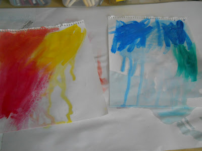
Yesterday I was trying all my primary and secondary colours on plain sketchpad paper.  I wanted a reference for exact hues when I wanted to use say, red, which can be a blue red (cool) or an orange red (warm). When I got all my colours on the papers I had a what if moment!  What if I put the colours on cloth?   Then I remembered that I had bought dyes and paints for fabrics. 

Dying fabric is not the same as painting fabric.  The colours adhere differently.  I wanted to see what painting would show as I have dye samples already.  I have a couple of dye posts under my To Dye For page.


So I unearthed my Pebo Setacolours and a few odd jars of fabric paint.  I did try a few acrylic paints meant for paper.  I wish I had also got white in Setacolour as it would be very useful to have the lighter, clearer options.


Here is what I discovered.


My favorite colour.  I did try to get orange by mixing the 2 different reds with yellow. 


Red has more variations that I'd have thought possible!


Purple is tricky.  The light area on the fabric is watered down lots. I tried mixing blue and red watercolours to get a violet. I need to spend some time mixing colours because when I did get the setacolours it was with the idea of mixing other options. But it was recommended that purple be specifically bought.  I can see why.


I'm not a baby blue person but I'm gaining an appreciation for cobalt blue.  Aqua is another favorite colour.
I did a small area of dirty water.  lol  Even the dirty water is useful for backgrounds.  But straight craft acrylics are very stiff.  The fabric paints are much softer.


The inks tend to bleed a lot and they are very matt.  Hmm, I wonder if you added some glitzy stuff???


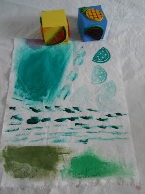
My biggest surprise was how well fabric paint stamped. These are very cheap kid's foam stamps.   I see no value in painting backgrounds when dyeing is softer and easier.  But dyes would probably bleed in making marks so paint is the way to go!  Even the craft acrylics would be useful for stamping, especially if one used a light hand on applying the acrylic and in pressing the stamp.

This seems like a lot of work but really it is helping me become more familiar with the various mediums and how they look and react.  I'd like to think these are warm up exercises before I take the plunge.  Perhaps it could also be stalling but I'm beginning to get the urge to actually try all these options out.  And that will be a good thing!

I'm linking up to TN&TN so if you'd like to see what my neighbours are doing, please click on the link.